Overview
Finding a place to play sports should not require searching multiple websites, calling venues, or driving across town just to check availability.
We Play is a multi-sport booking platform that helps users discover nearby sports venues, compare facilities, check real-time availability, and reserve courts from one mobile application.
The goal was simple: reduce the uncertainty between wanting to play and actually reaching the court.
Why I Built This
I grew up playing badminton in India, where booking a court was straightforward. Apps like Playo made it easy to discover nearby venues, compare prices, check availability, and reserve a court within minutes.
After moving to Texas, I expected a similar experience. Instead, I found a fragmented process. Some venues had outdated websites. Some required phone calls. Some only offered memberships. Others had no online booking system at all.
As a player, it was frustrating. As a designer, it felt like a clear product opportunity.
The Problem
People who recently move to a new city often struggle to find where they can play sports, whether courts are available, how much a session costs, and whether booking is possible online. Because most venues operate independently, users are forced to switch between Google Maps, outdated websites, Instagram pages, phone calls, and in-person visits before they can make a simple decision. The real problem is not just booking. The real problem is uncertainty before booking.
Research
I spoke with five recreational sports players living in Texas, including international students and working professionals. The goal was not to validate a specific feature. The goal was to understand how people currently discover venues, check availability, compare options, and decide whether to play.
"I drove twenty minutes only to find the courts were already full. (International player, Austin, TX)"
"I didn't even know there were badminton courts near me. (Immigrant player, Dallas, TX)"
"If one app existed for every sport, I'd use it every week. (Recreational player, Houston, TX)"
Meet the Users
Two personas emerged from the interviews, representing different motivations and tech comfort levels but the same core frustration: no reliable way to discover and book sports facilities.
- • Find courts near him with real-time availability
- • Book without calling or commuting just to check
- • Discover new venues beyond the one he accidentally found
- • No real-time availability shown anywhere online
- • Venues don't answer calls or don't know their own slots
- • Forced into memberships when he just wants one session

- • Discover what sports venues exist near him
- • Read reviews before committing to a venue
- • See pricing upfront without visiting in person
- • Every sport has a different website, or no website at all
- • No way to compare multiple venues in one place
- • Booking feels like an administrative task, not something fun
Empathy Map
Synthesizing what users think, feel, say, and do surfaced a consistent pattern: people want to play, but the discovery and booking process gets in the way.
- • "There has to be a better way"
- • "I know there are courts near me but I can't find them"
- • "I'm wasting my weekend doing research instead of playing"
- • Frustrated by wasted commutes to check availability
- • Confused about what sports venues exist near him
- • Excited when he finally finds somewhere that works
- • "I had Playo back home. Why is there nothing here?"
- • "I called and no one picked up. I just gave up."
- • "If there was an app I'd use it every week."
- • Searches Google Maps for "badminton near me"
- • Calls venues and hangs up after no answer
- • Relies on word of mouth from coworkers
- • Goes to the same single court because it's the only one he found
User Journey — Before & After
Mapping the journey end-to-end showed exactly where the current process breaks down, and how a centralized booking experience removes friction at every stage.
| Stage | Actions | Thoughts | Feelings | Emotion |
|---|---|---|---|---|
| Awareness | Decides he wants to play this weekend | "This should be easy" | Excited | 😊 |
| Search | Searches Google Maps, visits random outdated websites | "Why do none of these have websites?" | Confused, Overwhelmed | 😕 |
| Contact | Calls 3-4 venues, tries Instagram pages | "No one answers. What do I do now?" | Frustrated, Annoyed | 😤 |
| Booking | Drives to venue to check in person | "I could have done this in 2 minutes on an app" | Resigned, Stressed | 😞 |
| Playing | Finally plays, 2+ hours later than planned | "I'm not doing that process again next weekend" | Relieved but exhausted | 😌 |
Key Insights
Product Opportunity
How might we reduce the uncertainty involved in discovering, comparing, and booking sports facilities?
Product Vision
We Play centralizes venue discovery, availability, pricing, reviews, and booking into one experience so users can spend less time searching and more time playing.
The product is designed around one user intent: “I want to play.” Not: “I want to search five websites and call three venues before deciding.”
Design Principles
Key Product Decisions
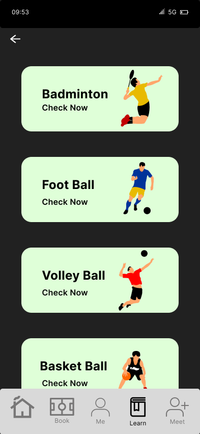
Cross-sport discovery lets users continue exploring when their first choice is unavailable.
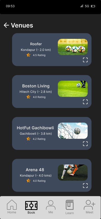
Venue cards combine availability, distance, ratings, pricing, and amenities to support faster decisions.
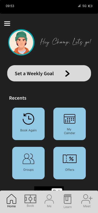
Recent bookings support fast repeat behavior while sports categories keep discovery accessible.
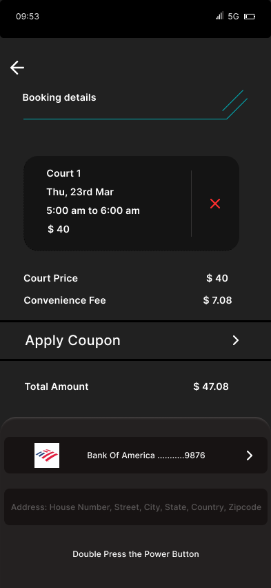
The summary screen reduces payment hesitation by making all booking details visible upfront.
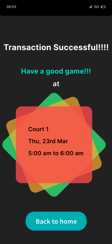
A clear confirmation state reassures users the booking was completed successfully.
User Flow
Information Architecture
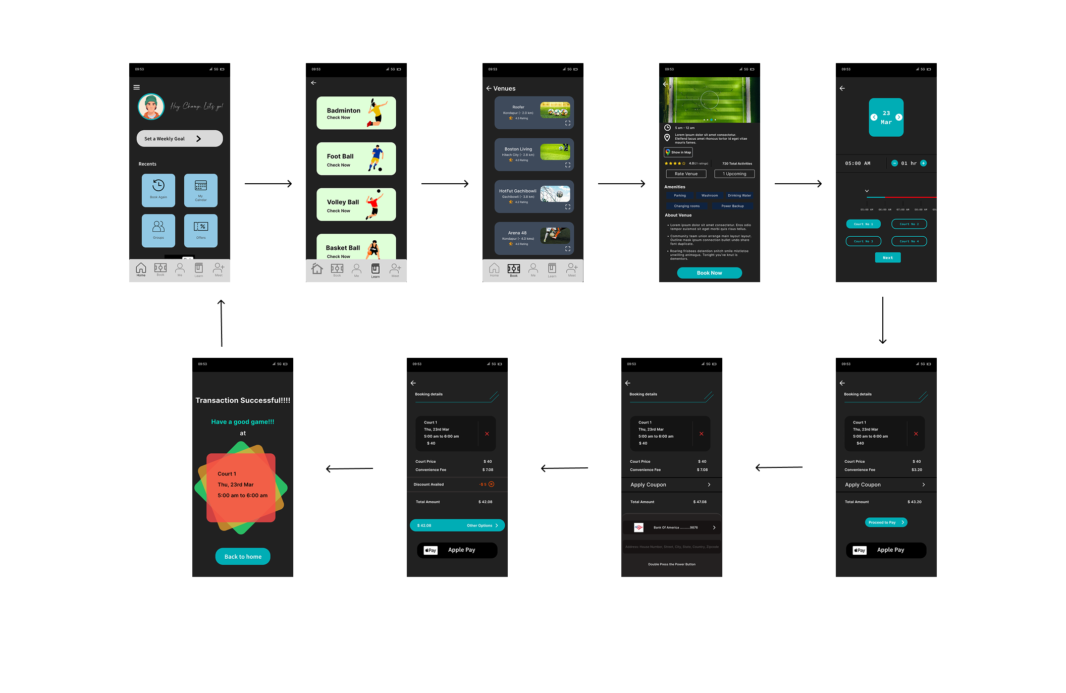
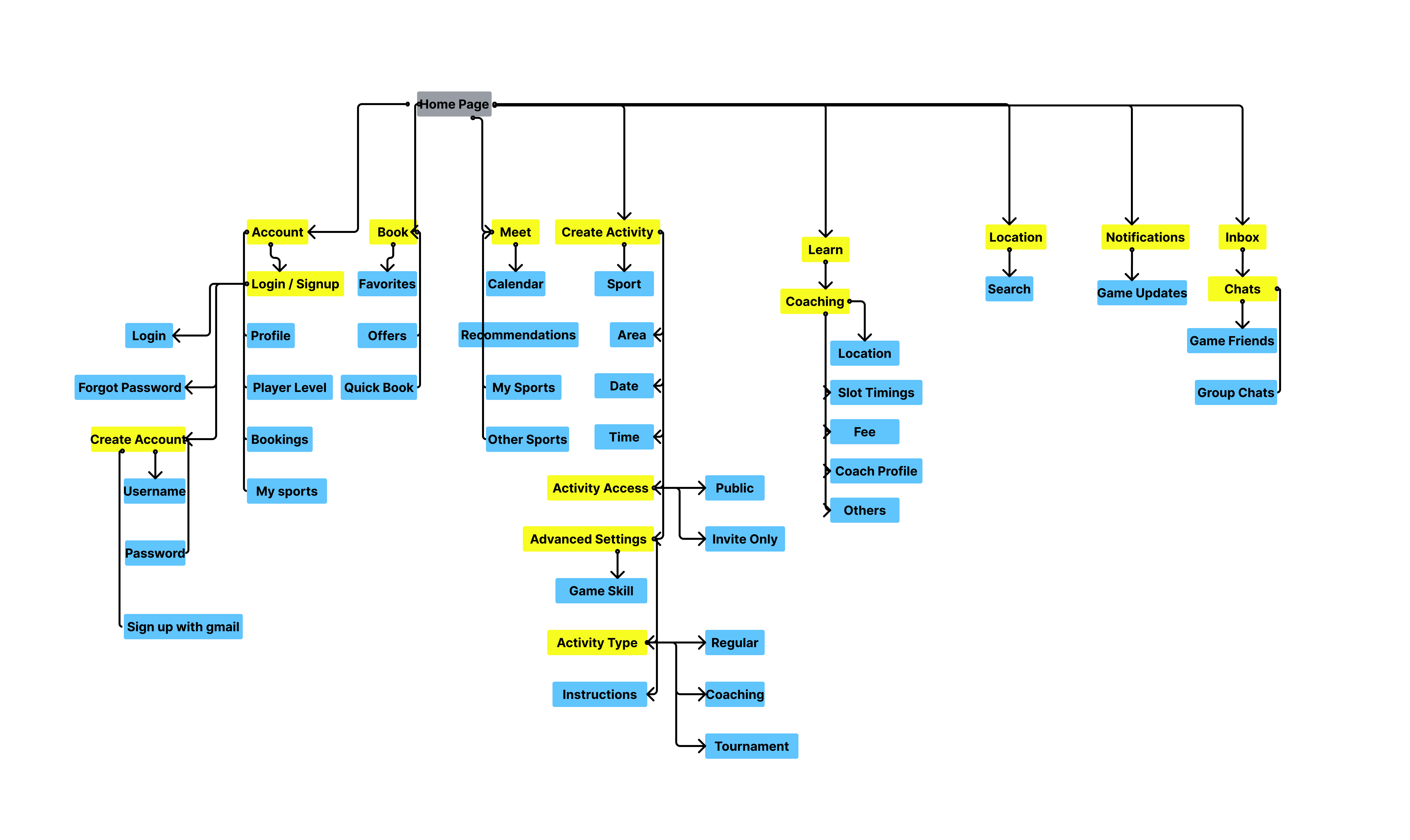
The app structure follows the user's natural decision-making process: Discover → Compare → Book → Play.
Home supports fast repeat actions and venue discovery. Book supports sport selection, venue selection, slot selection, payment, and confirmation. Learning supports coaching, beginner programs, and training opportunities for users who want to explore new sports. Profile stores bookings, favorites, account settings, and saved preferences.
Wireframing
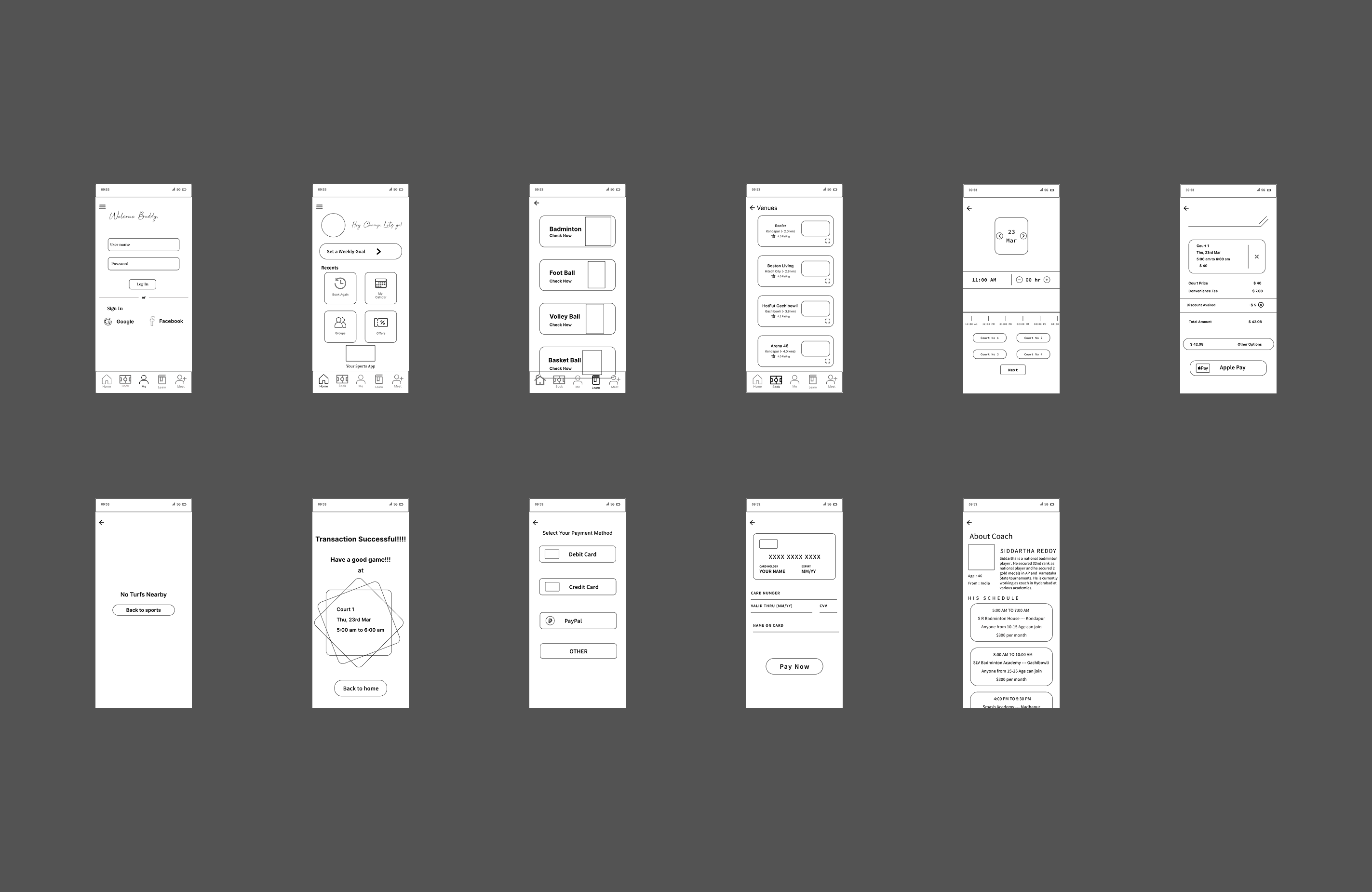
Before moving into high-fidelity design, I explored low-fidelity layouts to simplify the booking journey. The goal was not visual polish. The goal was to decide what users should see first, which actions needed priority, and how many decisions should exist on each screen.
Design System
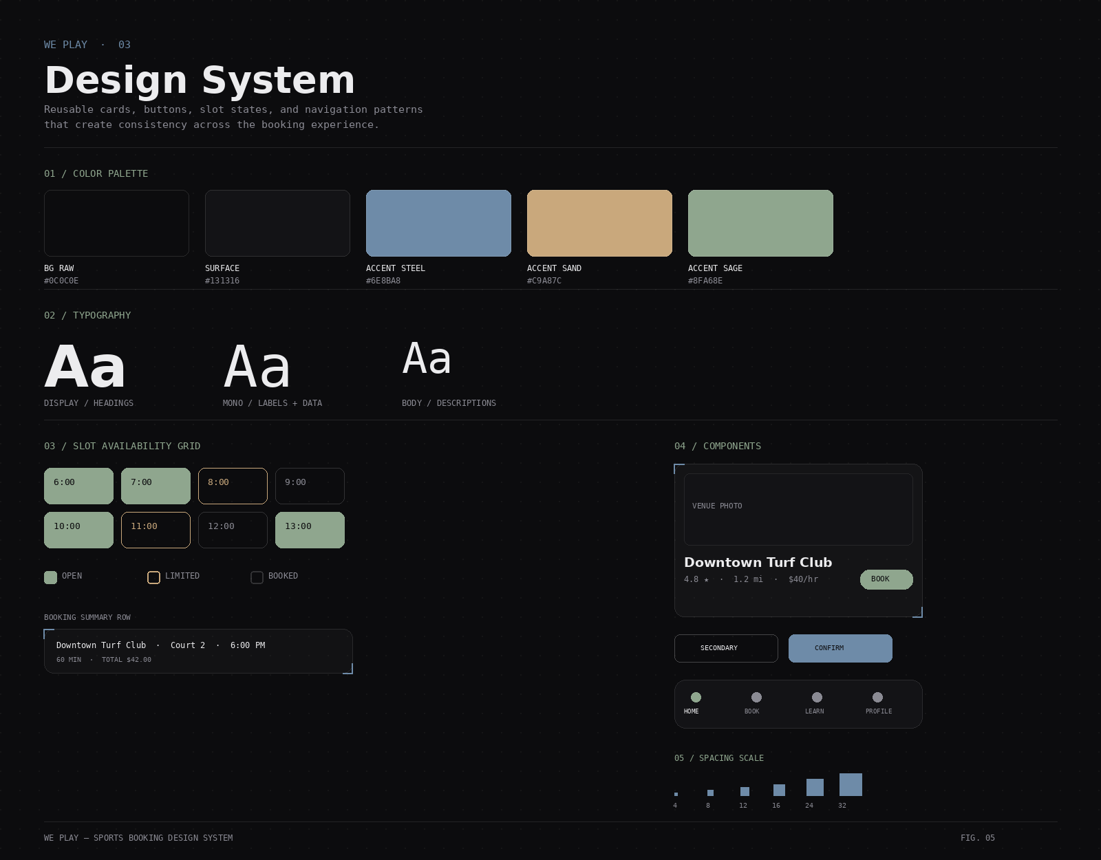
The interface uses a reusable component system to keep the booking experience consistent across screens. Core components include venue cards, sport category cards, slot grid states, primary buttons, secondary buttons, booking summary rows, bottom navigation, and confirmation cards.
The visual system uses clear hierarchy, consistent spacing, and strong action states so users always understand what to do next.
High-Fidelity Design
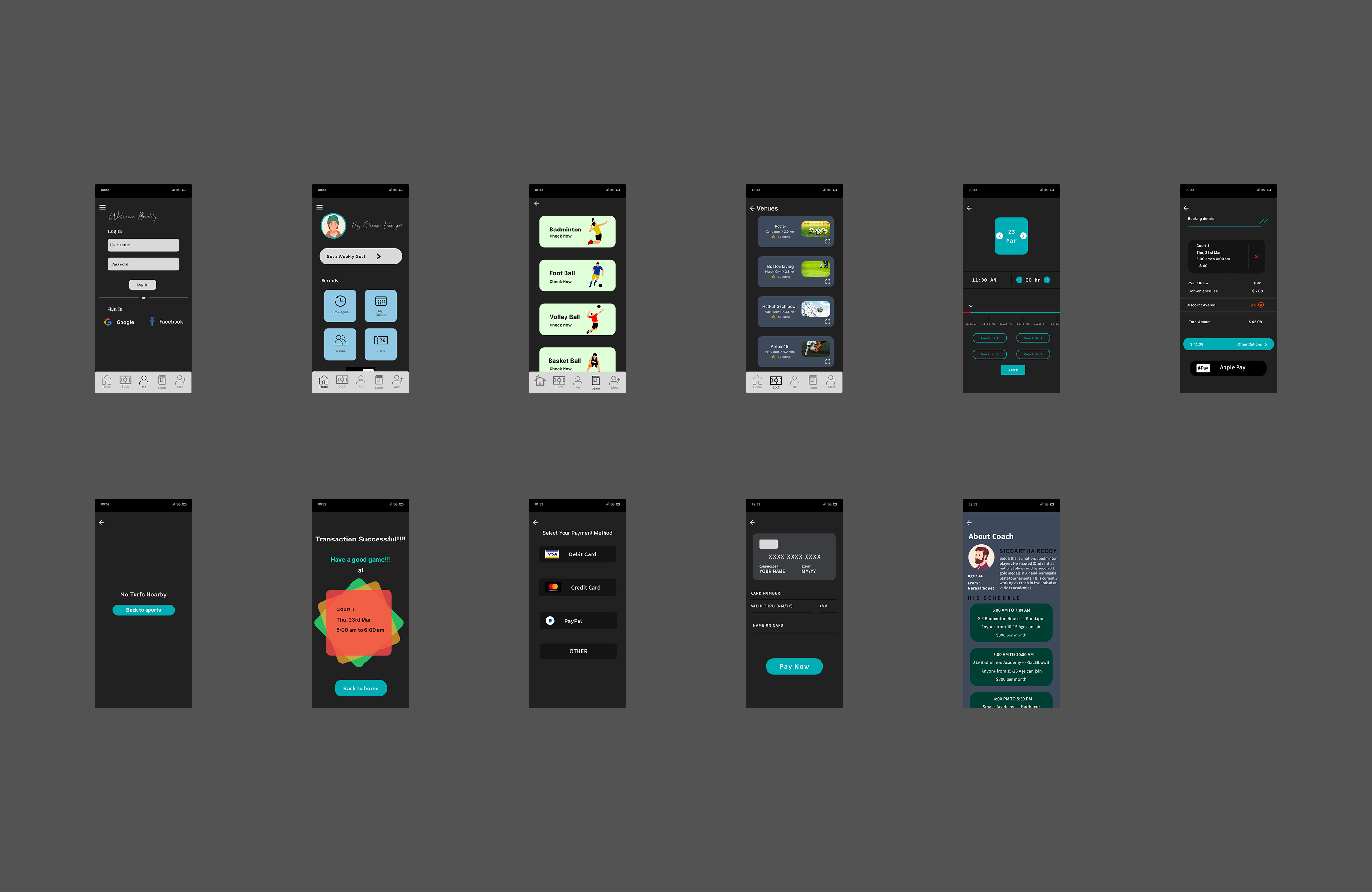
The final interface balances clarity with energy. Sports are active, social, and fast-moving, so the product needed to feel modern and dynamic without slowing down the booking task. The final screens focus on direct actions, readable information, clean cards, and strong feedback states.
Interaction Design
Every interaction was designed to reduce friction or confirm user action. Key interaction patterns include animated slot selection, expandable venue cards, clear booking progress feedback, bottom navigation transitions, swipe-friendly cards, button press feedback, loading states, and confirmation feedback.
The goal was to make the experience feel responsive without adding unnecessary motion.
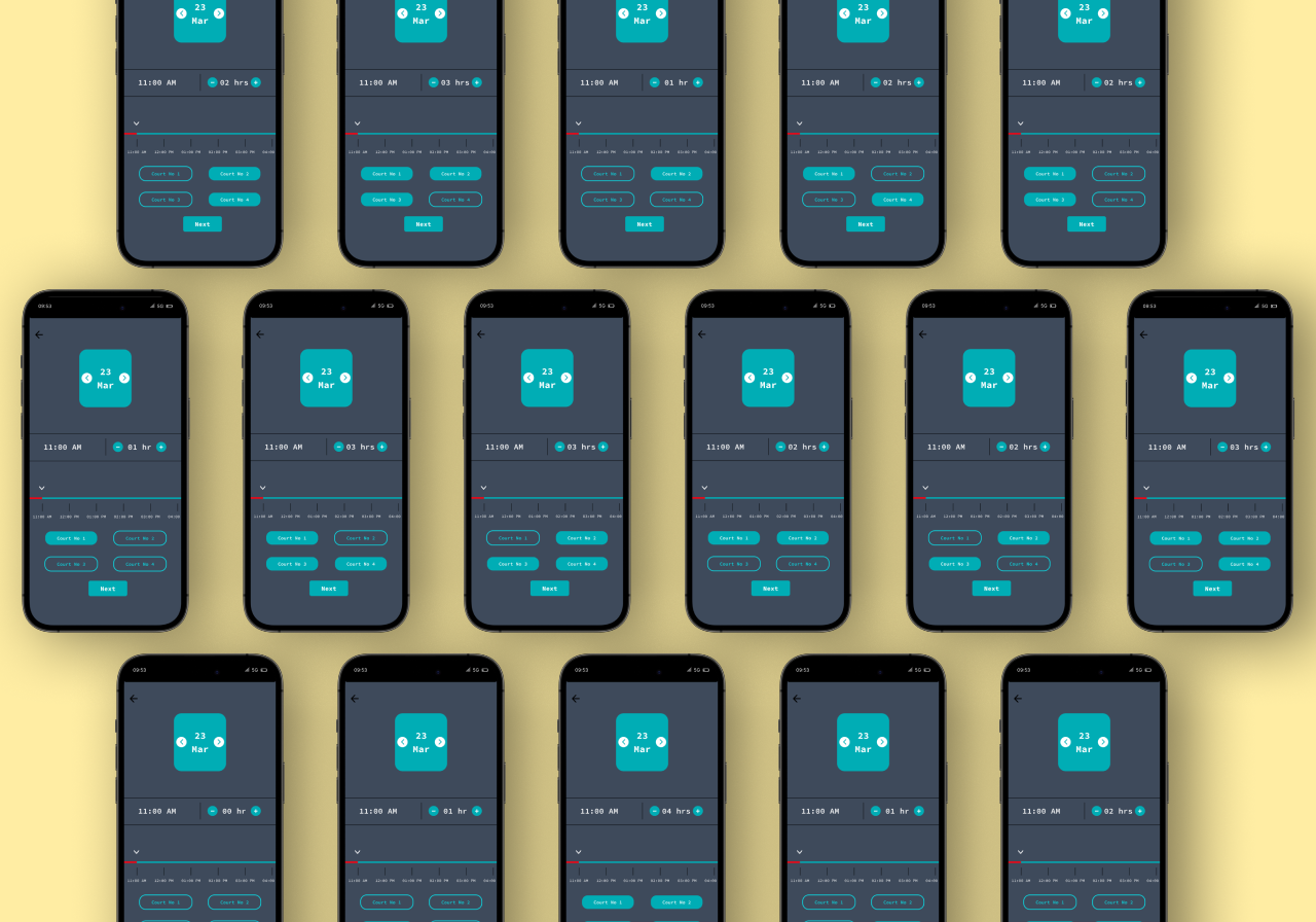
Microinteractions across slot selection, venue cards, navigation, and booking confirmation.
Motion Design
Motion was used as communication, not decoration. The launch animation introduces the product identity. Page transitions maintain spatial continuity. Slot selection animations confirm choice. Payment and confirmation motion reassure users that the booking has been completed successfully.
Launch animation, page transitions, slot feedback, and confirmation motion.
Interactive Prototype
The interactive prototype demonstrates the complete booking experience from opening the app to receiving confirmation. The prototype allows users to browse sports, compare venues, select a slot, review details, complete payment, and receive a booking confirmation.
Accessibility Considerations
I considered accessibility throughout the interface by using readable typography, clear tap targets, strong contrast, consistent icon labels, visible selected states, and availability indicators supported by both color and text.
This is especially important for the slot grid, where users should not rely on color alone to understand availability.
Reflection
Designing We Play taught me that users do not always need more features. They need more certainty.
The biggest challenge was not designing an attractive booking interface. It was reducing the number of questions users had to answer before they could confidently decide where to play.
This project helped me think more clearly about product strategy, user behavior, interaction design, and how small decisions in a flow can prevent users from giving up.
Future Improvements
Outcome
We Play demonstrates an end-to-end product design process: identifying a real problem, validating it through user conversations, translating insights into product decisions, designing a complete booking flow, building interaction patterns, and prototyping a polished mobile experience.
The final product reduces friction across the sports booking journey by helping users discover venues, compare availability, recover from unavailable slots, and book with confidence.