"Flexity was designed to test whether a streaming interface could feel alive through motion, not just look good as a static homepage."
Overview
Flexity is a desktop OTT streaming platform concept focused on content discovery, motion behavior, and interactive browsing. The project explores how a streaming homepage can feel cinematic, responsive, and premium through carefully designed transitions, hover states, carousel movement, and brand animation.
The goal was not to copy an existing platform. The goal was to understand what makes premium streaming interfaces feel polished, then design an original experience with its own visual identity and motion language.
The Problem
Many streaming UI concepts look polished in screenshots but feel flat when users interact with them. Content cards, hero sections, and navigation often appear visually complete, but the experience lacks motion feedback, browsing momentum, and the cinematic quality users expect from entertainment platforms.
Project Goal
Design a streaming homepage that feels dynamic and interactive from the first second: a logo reveal that establishes brand identity, a hero carousel that responds to user input, movie cards that reward exploration, and a visual system that feels distinct from existing streaming brands.
My Role
I worked across visual design, interaction design, and motion prototyping. I designed the brand direction, homepage layout, hero carousel, movie cards, hover states, color system, and interactive Figma prototype.
Design Strategy
I treated motion as part of the product system, not decoration. Each animation had a job: introduce the brand, guide attention, confirm interaction, or create browsing momentum. This helped the prototype feel more like a real streaming experience instead of a static UI board.
Phase 01 — Brand Launch Animation
The launch animation became the first expression of the brand. I explored timing, spacing, fade behavior, letter reveal, and contrast to make the Flexity identity feel cinematic before users even reached the homepage.
The final direction uses a dark stage, bold letter spacing, and a restrained reveal. It feels premium without becoming too loud or distracting.
Phase 02 — Hero Carousel Interaction
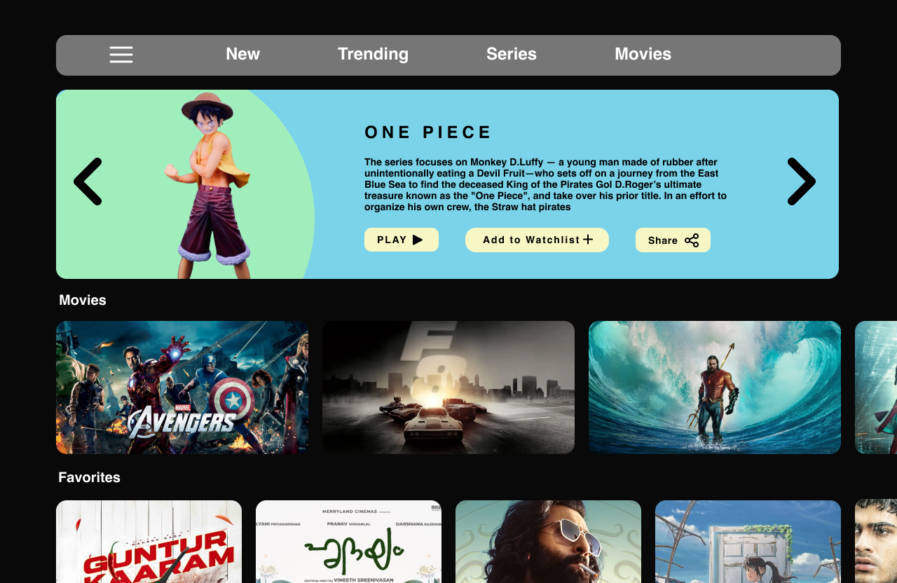
The hero carousel was the most complex interaction in the project. Each arrow click triggers multiple coordinated changes: character movement, title transition, summary animation, background color shift, and button state updates.
The challenge was making all of these elements move together without feeling chaotic. The final interaction creates energy while keeping the selected title readable and easy to understand.
Phase 03 — Card Microinteractions
The movie cards were designed to feel rewarding without demanding attention. On hover, the card expands slightly, the border becomes more visible, a dark gradient improves readability, and the title moves into view.
This small interaction gives the page a sense of responsiveness. Users get feedback immediately, but the animation stays subtle enough to support browsing instead of interrupting it.
Key Design Decisions
Visual System
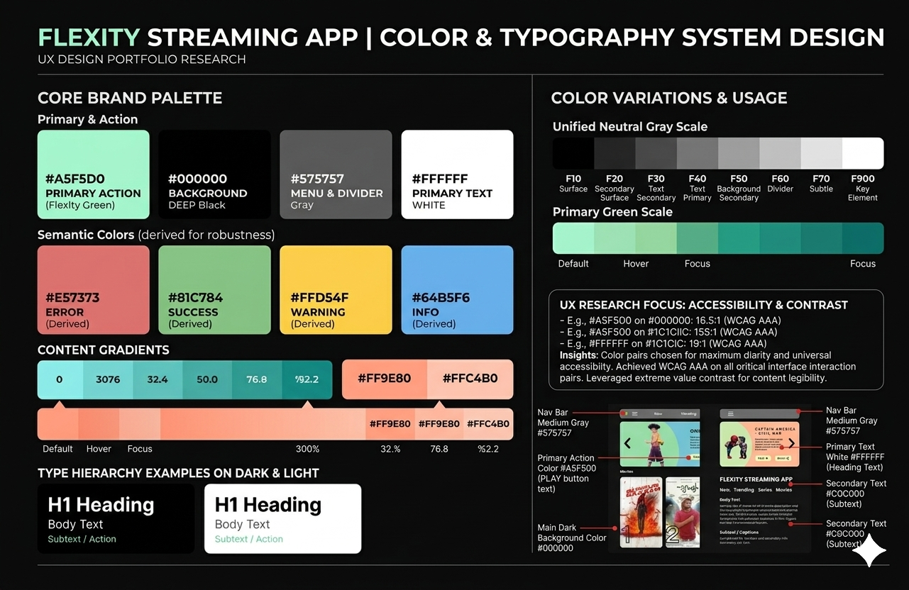
The visual system uses a dark interface, mint-green brand accents, large media surfaces, soft gradients, and high-contrast content cards. The goal was to make the platform feel immersive while keeping navigation and browsing actions clear.
The interface avoids unnecessary visual noise. Content remains the focus, while motion and color create personality around it.
Interaction Details
Key interactions include logo reveal, carousel transitions, arrow-triggered content changes, character movement, title stagger animation, card hover expansion, gradient overlays, and animated emphasis states.
Together, these details create a streaming interface that feels active, polished, and intentional.
What I Learned
Flexity helped me understand that motion design is not about adding animation after the layout is finished. Motion changes how users feel the product. It controls rhythm, focus, feedback, and personality.
The biggest lesson was learning to design movement with restraint. The best interactions are often the ones users do not consciously analyze; they simply make the product feel better.
What I Would Improve
The next step would be designing a complete title-detail page with trailer preview, episode list, cast information, related recommendations, and continue-watching behavior. The current prototype focuses on discovery; a complete OTT product also needs a strong detail experience.
Prototype
Outcome
Flexity demonstrates my ability to design a polished interaction-heavy product experience, create a distinct visual system, prototype complex motion behavior, and think beyond static UI screens.