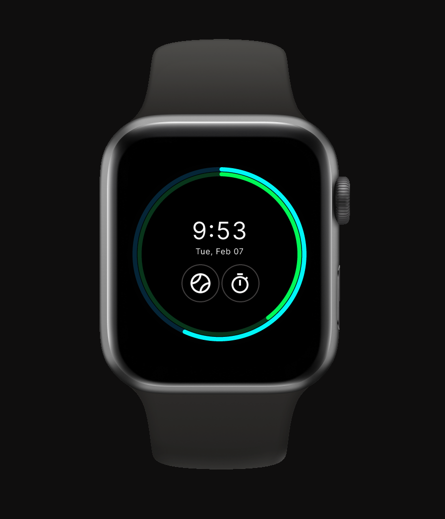
"Designing for a smartwatch forced me to rethink interface design at its smallest scale: less space, fewer actions, faster decisions."
Overview
SmartWatch OS is a wearable UX redesign focused on compact interface design, circular screen constraints, glanceable information, and companion app continuity.
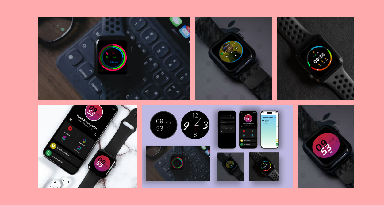
The project explores how core smartwatch experiences (watch face, fitness tracking, music, notifications, ambient display, and companion mobile controls) can work together as one connected ecosystem.
The Problem
Smartwatch interfaces operate under extreme constraints: small circular screens, limited input methods, short attention spans, and glance-based usage. A successful wearable interface must communicate quickly, reduce unnecessary interaction, and make every screen useful within seconds.
Design Goal
Redesign a smartwatch experience that makes key information easier to scan, reduces interaction effort, supports quick task completion, and extends important watch features into a companion mobile app.
Wearable UX Constraints
Research Approach
I used the physical smartwatch as the research object. I studied how information appears on the wrist, how quickly screens need to be understood, how swipe-based movement feels, and where compact UI patterns become difficult to read.
Instead of designing from desktop assumptions, I treated the watch as a separate interaction environment with its own constraints, habits, and expectations.
Core Experience Map
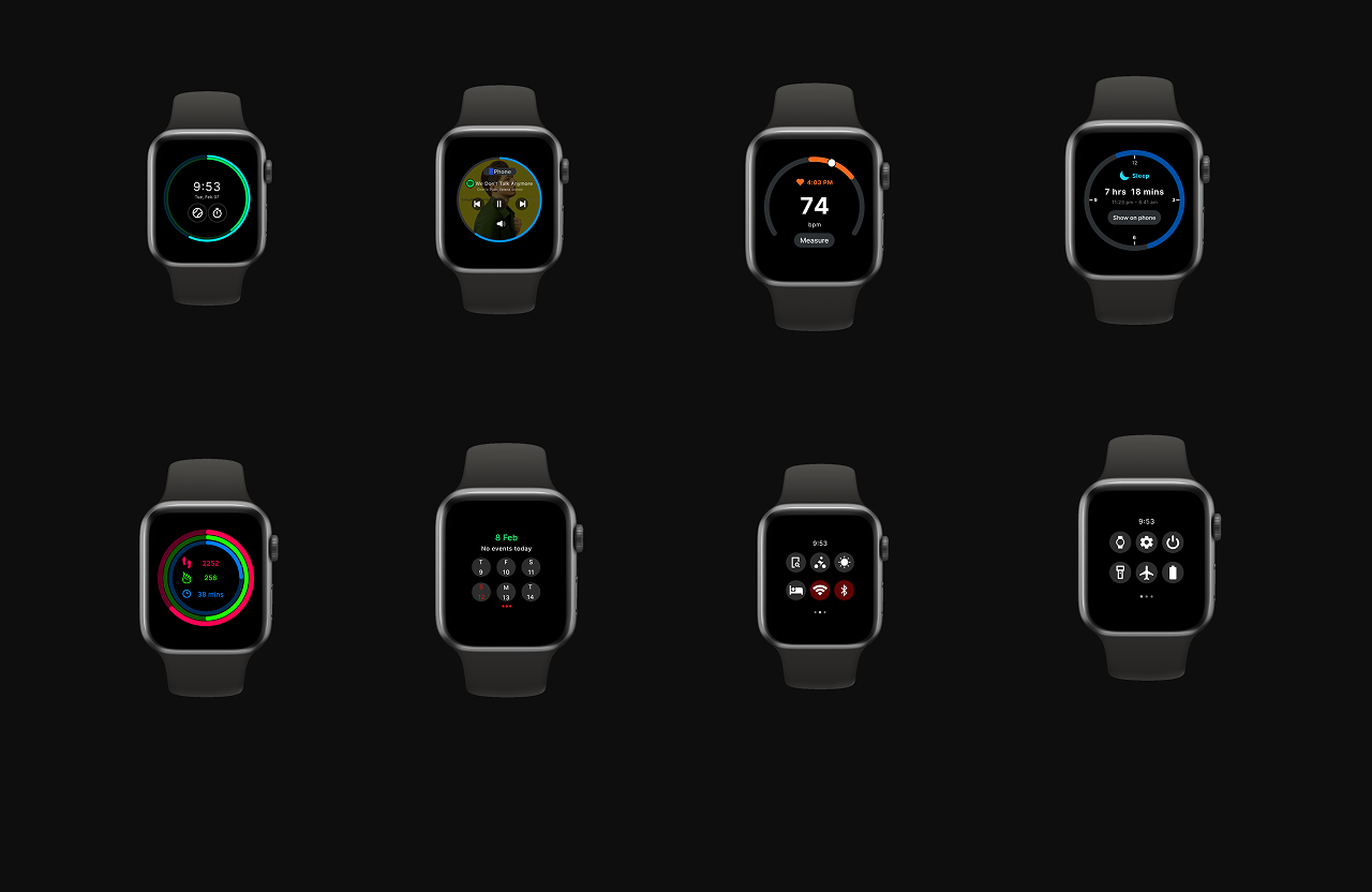
The redesign focused on the screens users are most likely to check quickly: watch face, ambient mode, fitness progress, music controls, notifications, settings, and companion app controls.
Decision 01 — Glanceable Watch Face
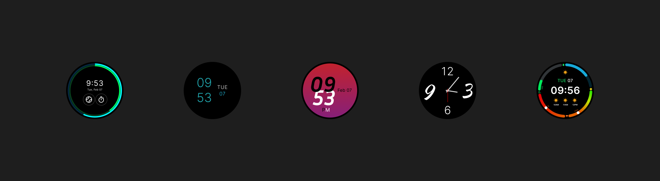
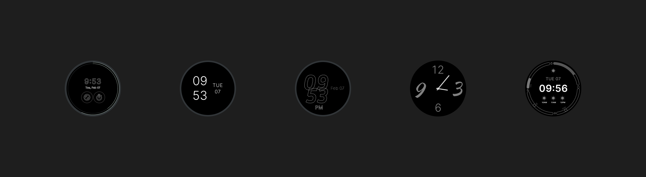
The watch face was designed to make key information visible at a glance. Time remains the primary element, while secondary details such as activity progress, battery, and quick status indicators stay visually controlled.
Decision 02 — Ambient Display Simplification
Ambient mode reduces the interface to only essential information. The design removes heavy visual elements and keeps the screen readable without overwhelming the always-on state.
Decision 03 — Fitness Progress Rings
For fitness tracking, I used a ring-based progress system because circular progress fits naturally inside the watch form factor. This made activity status easier to scan without relying on dense numbers.
Ring-based activity screen designed for quick progress scanning on a circular interface.
Decision 04 — Music Controls for Quick Actions
The music screen prioritizes large touch targets, visible playback status, and simple controls. The goal was to make common actions usable without forcing users to focus on the screen for too long.
Compact music interface optimized for quick playback control and readable touch targets.
Decision 05 — Companion App Continuity
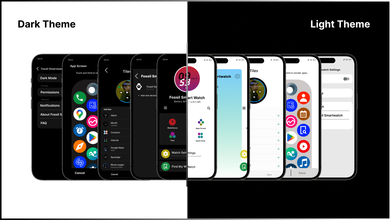
After designing the watch interface, I extended the system into a companion mobile app. The mobile app gives users more space for settings, progress review, personalization, and feature management while keeping the watch experience lightweight.
Key Design Decisions
Interaction Design
The interaction system focuses on fast movement between compact screens. Swipe navigation supports quick transitions, while tap targets are designed around the limited precision of a small wearable display.
Animations were kept simple and functional. Motion supports state changes, screen transitions, and feedback without slowing down the glance-based nature of smartwatch use.
Design System
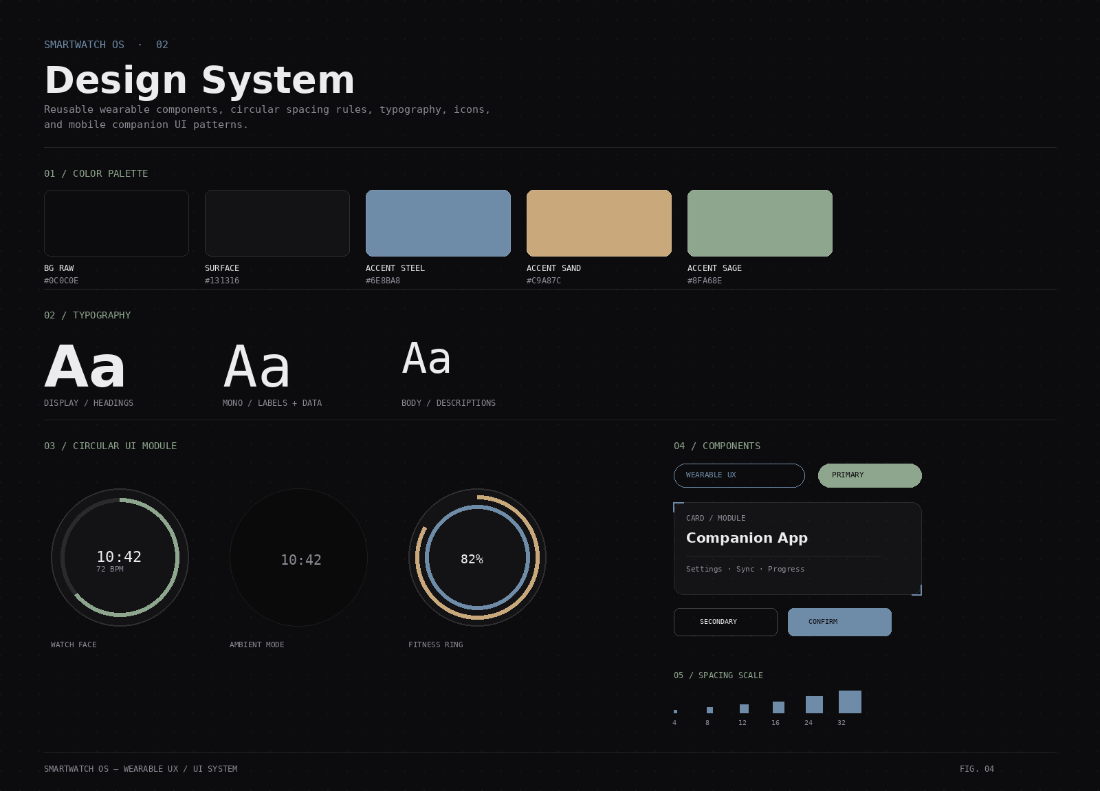
The design system uses compact typography, high-contrast UI elements, circular alignment, simplified icons, and reusable components for watch faces, progress indicators, control cards, and mobile companion screens.
What I Learned
This project helped me understand that wearable design is not just smaller mobile design. It requires a different mindset: reduce choices, prioritize glanceability, respect physical constraints, and design for moments that last only a few seconds.
The biggest learning was that every pixel on a smartwatch has to earn its place. When space is limited, hierarchy, spacing, and interaction feedback become even more important.
What I Would Improve
The next step would be testing the prototype on an actual watch frame with users, refining tap target sizes, validating readability under different lighting conditions, and improving accessibility for color contrast, motion sensitivity, and text scaling.
Prototype
Outcome
SmartWatch OS demonstrates my ability to design for constrained interfaces, create glanceable wearable UI systems, structure compact navigation, prototype interaction flows, and extend a wearable product into a companion mobile experience.