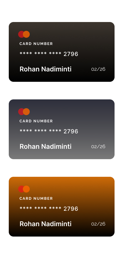
"This project explores how one simple fintech interaction can feel completely different when motion, direction, and timing change."
Overview
Credit Card Animation × 3 is a focused microinteraction study built in Figma. I designed three variations of the same core interaction: a card revealing transaction details through motion.
The goal was to understand how animation direction, easing, timing, and trigger behavior change the feeling of a digital object.
The Problem
Financial interfaces often treat motion as decoration. A card flips, slides, or expands, but the movement does not always communicate state, hierarchy, or user control. I wanted to explore how a small interaction could feel more physical, intentional, and responsive.
Motion Goal
Create three motion directions for the same credit card interaction and compare how each one changes the emotional quality of the experience.
Exploration 01 — Horizontal Flip
Front face flips left to right to reveal transaction history.
The first version uses a left-to-right flip. This motion feels direct and familiar because it behaves like turning over a physical card.
This became the baseline interaction. It helped me understand the basic timing needed for the card to feel believable: front state, edge moment, back state, and settling motion.
Exploration 02 — Vertical Flip
The same card reveal using a top-to-bottom motion direction.
The second version changes the motion axis from horizontal to vertical. The interaction still reveals the same information, but the feeling changes.
The vertical flip feels more like opening a panel or lifting a cover. It is less expected than the horizontal version, which makes it feel more experimental.
Exploration 03 — Rotational Reveal
A bottom-edge rotation with bouncy easing and coordinated card movement.
The third version moves beyond a simple flip. The card rotates upward from the bottom edge and settles into the transaction view.
This was the most challenging version because the selected card had to rotate while the other cards moved away without competing animations. The final result feels more dynamic, dimensional, and premium.
Key Interaction Decisions
What I Learned
This project taught me that motion direction changes perception. A horizontal flip feels familiar. A vertical flip feels more like a reveal. A rotational motion feels more dimensional and premium.
I also learned that interaction design is not only about the selected object. The surrounding elements matter too. When one card becomes active, the other cards need to move in a way that supports focus instead of creating visual noise.
Prototype
Outcome
Credit Card Animation × 3 demonstrates my ability to explore motion systematically, compare interaction alternatives, prototype advanced Figma behaviors, and use animation to make interface states feel physical and intentional.